Aerospace E‑Commerce Platform
How I established a research-based product design process for Bombardier’s online parts ordering platform.
How I established a research-based product design process for Bombardier’s online parts ordering platform.
Reframed a product vision around user needs
Reduced time-to-decision on the PDP by 50%
Bombardier's online parts ordering platform has been supporting aircraft maintenance technicians both internally and externally, providing a way of ordering aircraft parts for 24/7 around the world.
When I joined the team, their product design approach was still coming together. While most designs are confidential, I’m excited to share a few key highlights.
The portfolio and it's information are my personal ideas and opinions, which do not represent Bombardier.
The objective is straightforward:
Increase the number of orders through the e-commerce platform, so that the customer support team can focus on other important tasks.
April 2024 - August 2024
Discovery research was completed and proposed a new design for the Product detail page (PDP). The rest of the product design work, including search, checkout, and delivery, is still ongoing.
Product team didn't have clear long-term action items due to the displaced user insights and outdated research data.
Not everything can be fixed right away. The business aviation supply chain is a complex system, unlike typical consumer-facing e-commerce platforms. We need to review and align business processes.
There was a misalignment between business goals and user needs, resulting in losing financial values of running the e-commerce platform.
Below is the process I decided to follow based on the user and business needs. The steps are flexible and not strictly linear, as I worked within an Agile framework.
I chose a manual research approach because an OEM parts ordering platform serves a small, specialized group of users who deal with complex aircraft parts and rules. Since there was no automated user‑recruiting system in place, manual research allowed me to reach the right users and understand their real workflows.
Talked to 6 people including 1 external power user.
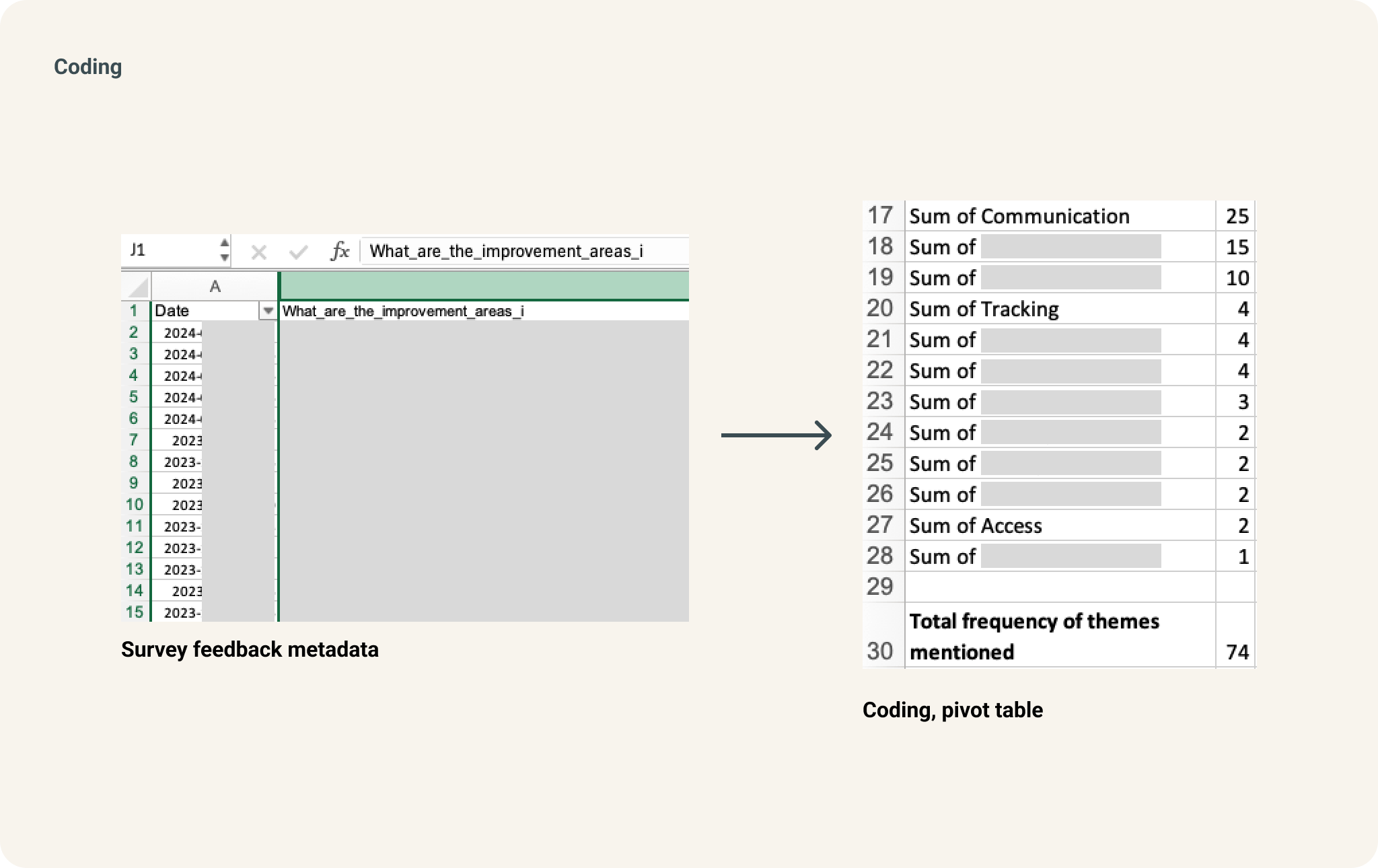
The most common issue people mentioned was communication, mainly that there weren’t enough updates after they submitted an order. I used Excel to create charts and Figjam to set up a collaborative space for the team to review the survey results.
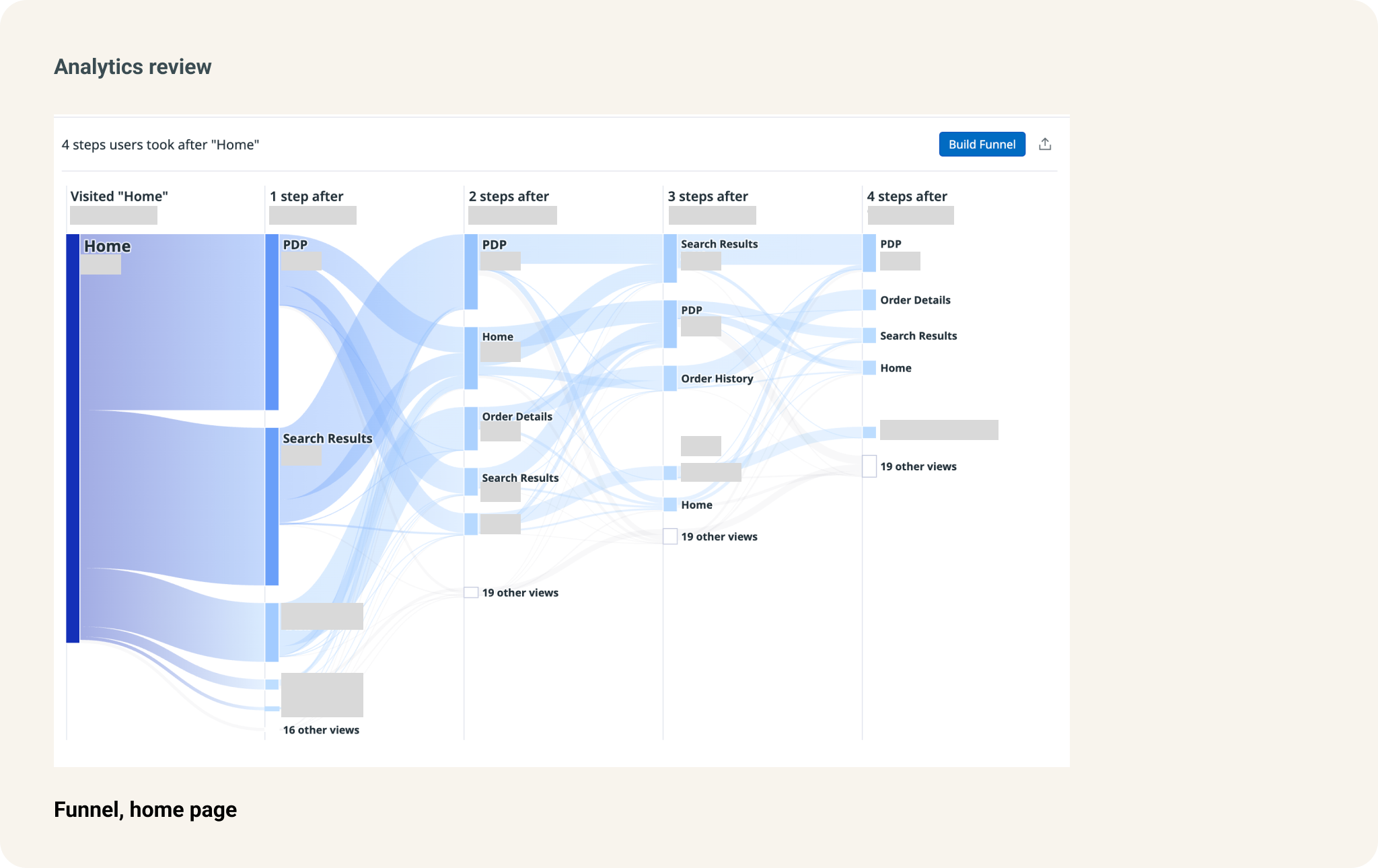
Although the home page had many buttons linking to the quick guides and video tutorials, we discovered that most users primarily visited the site to search for parts. This kind of small insight had a big impact and helped us realign our product team strategy, allowing us to better serve user needs and support business goals.
We decided to focus on the product details page (PDP) design, based on insights from the discovery research conducted in steps A through C.
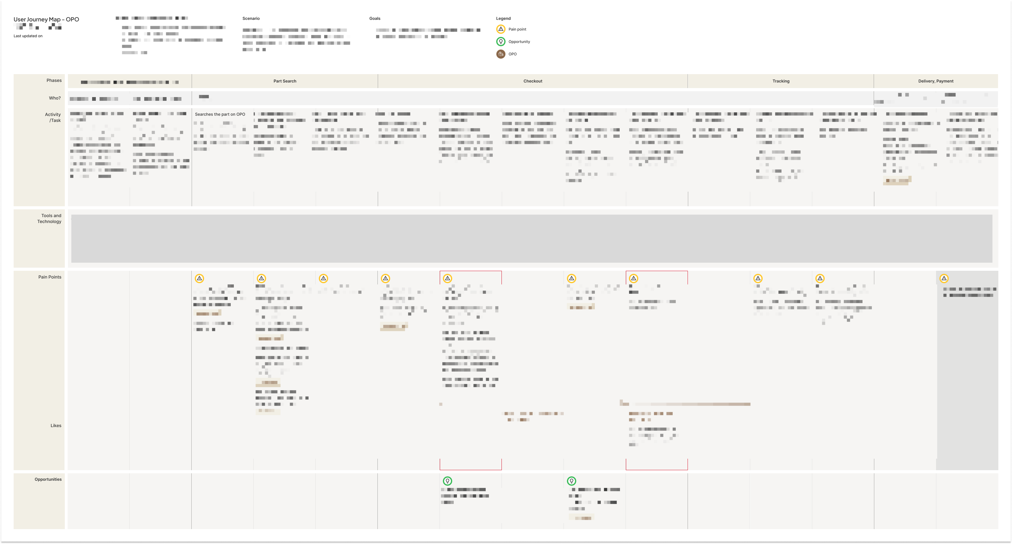
I also revised the user journey map to focus on factual insights rather than assumptions, making it a more reliable single source of truth 🌟
I showed the redesigned Figma mockups to the external users. I recruited participants by reaching out to customers who had previously attended user feedback session for other internal products.
Each interview lasted 30-45 minutes. After speaking with three external users, I began to notice recurring patterns.
I redesigned the mockups based on the user feedback. Some business rules were blocking potential user experience improvements, so I raised these issues with the team for further discussion.
The homepage redesign and development have been completed. We're now focusing on other pages that are more crucial to the user experience in aircraft parts ordering.
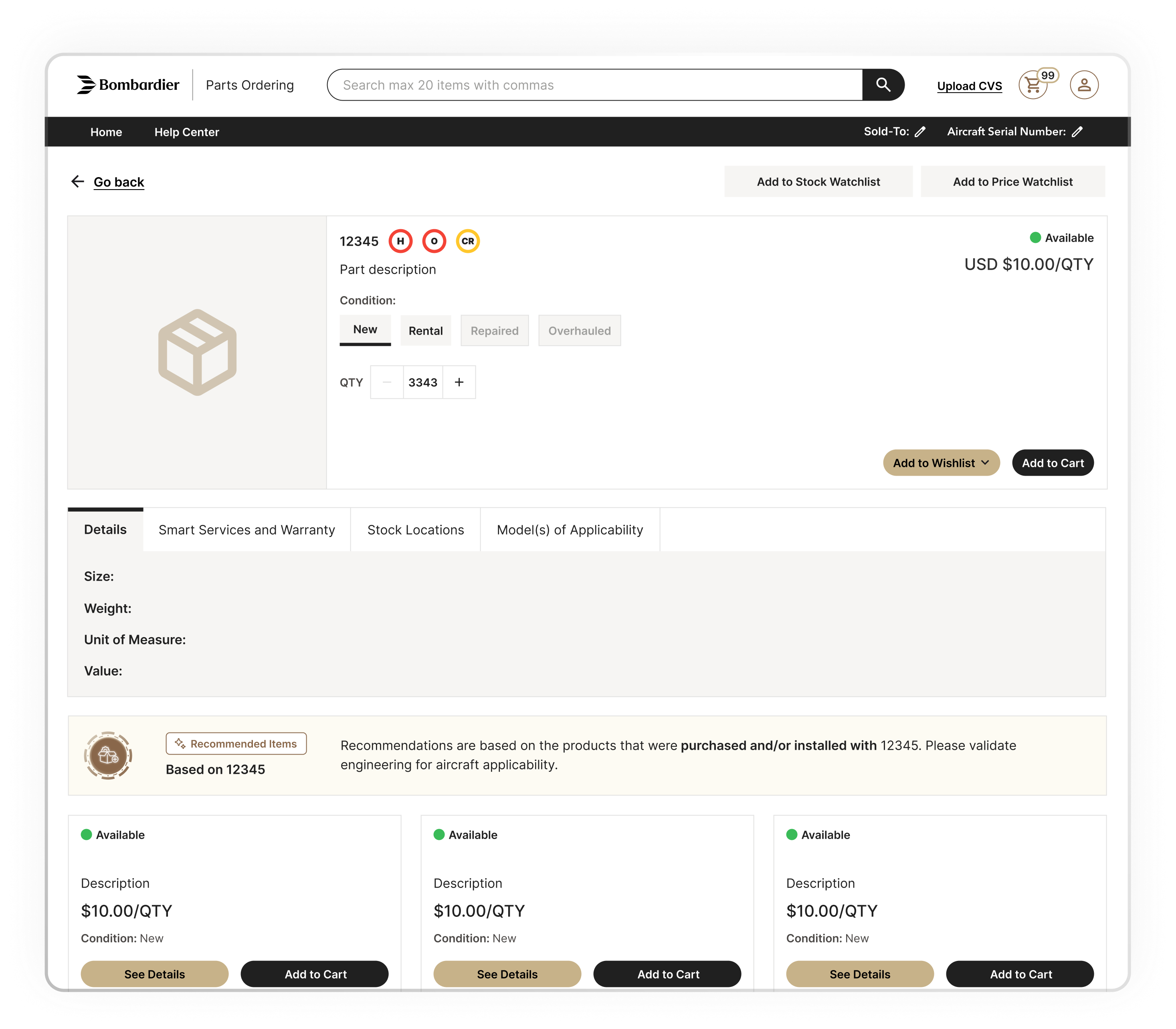
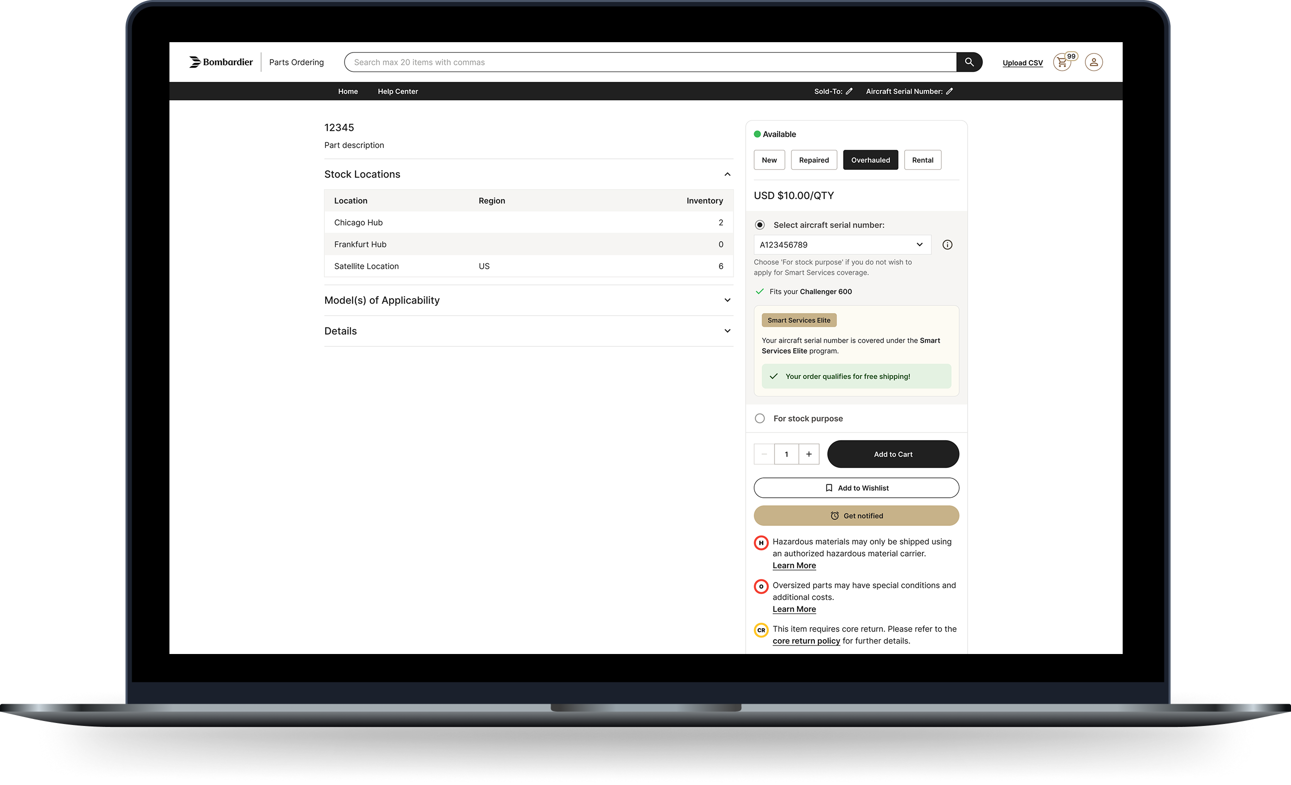
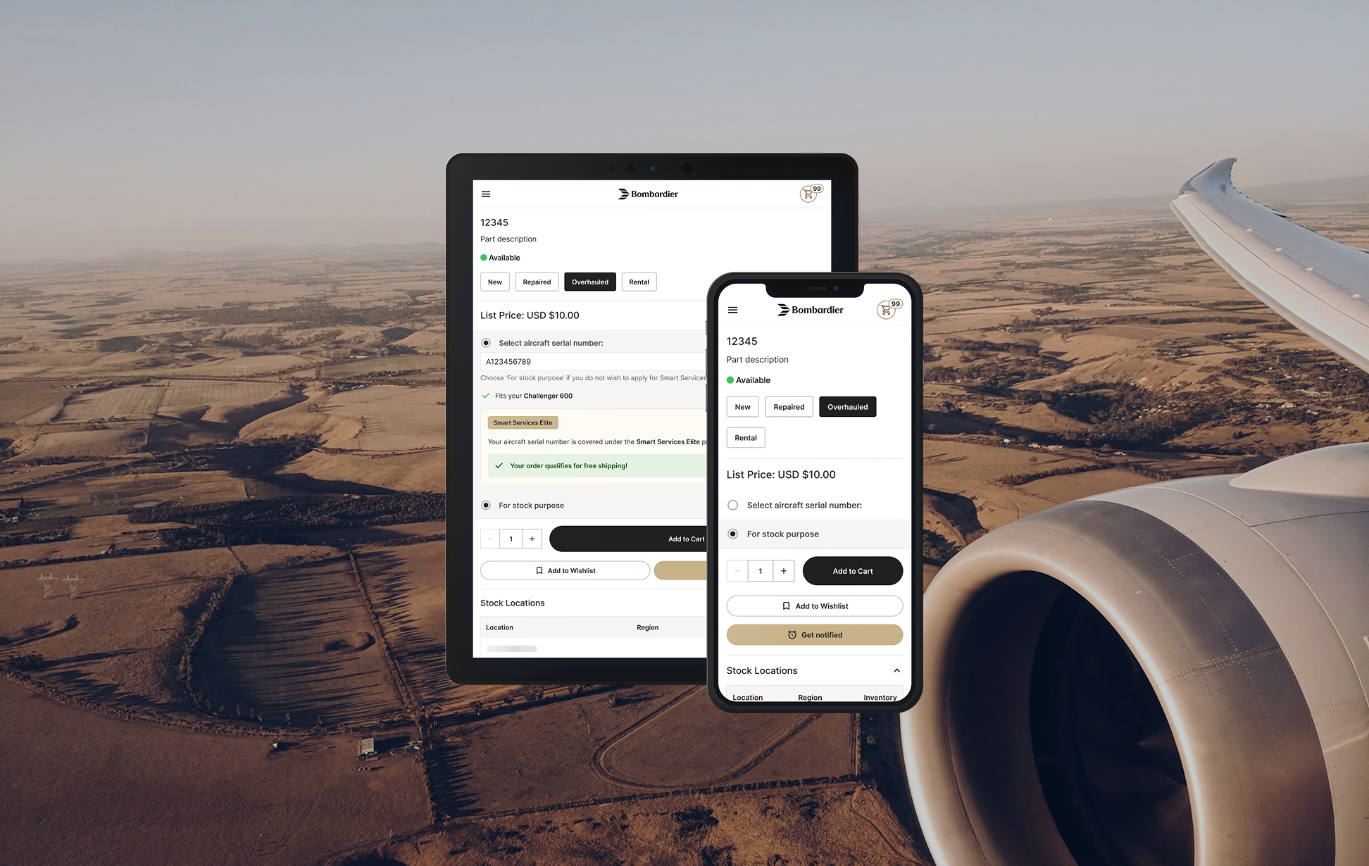
The platform was known for a long loading time due to the technical constrains. After a through research on the e-commerce best practices, I proposed a combination of lazy loading and two-column layout. Even from the day one of the new design release, the impact was immediate. The new page reduced the amount of time each user spend on PDP for about 50%.
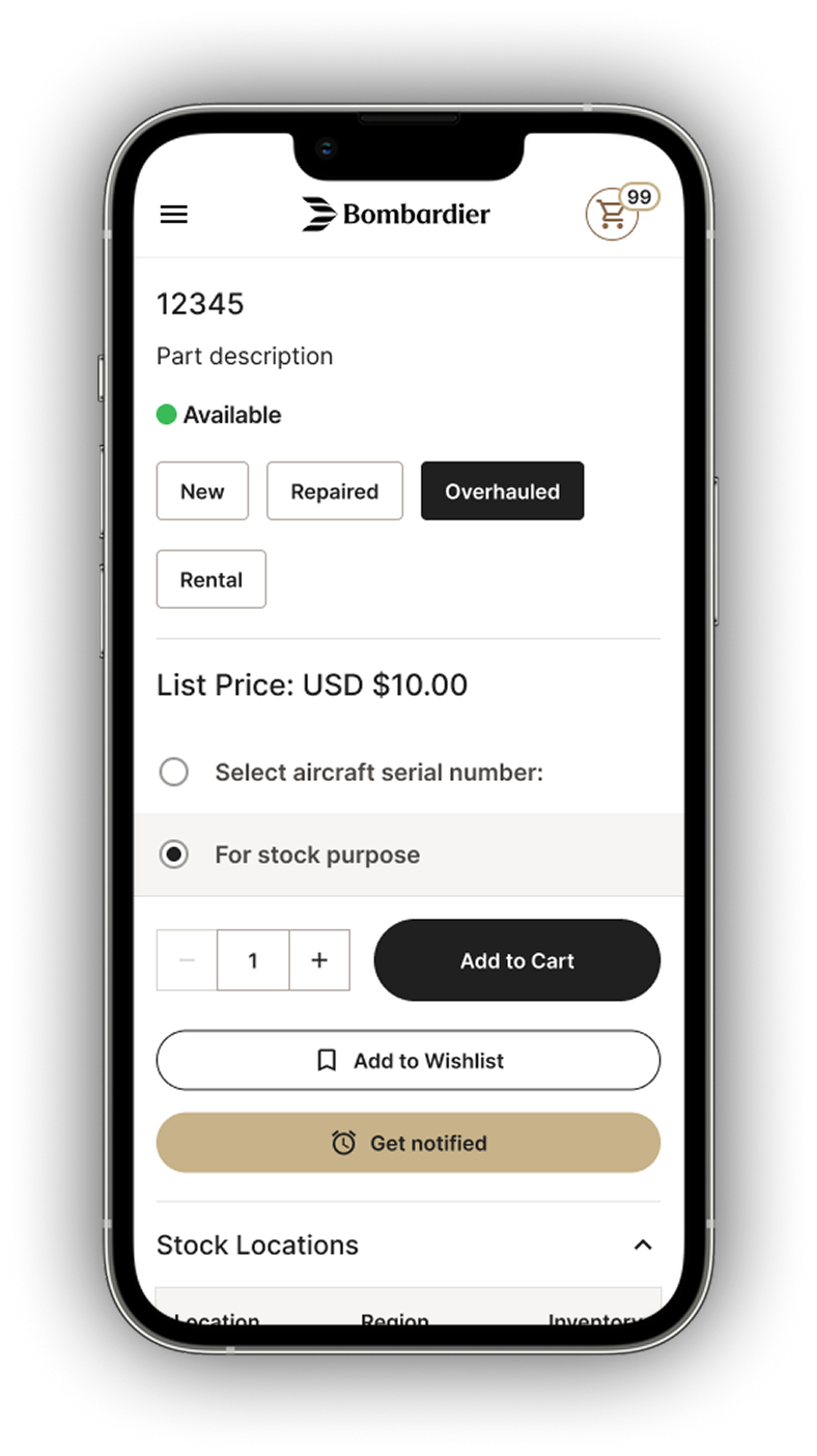
We learned that the stock location is the most important information for the users besides the pricing and availability. At the same time, they wanted to verify the rest of the information including the coverage details. The new layout covers the user needs for all device types.
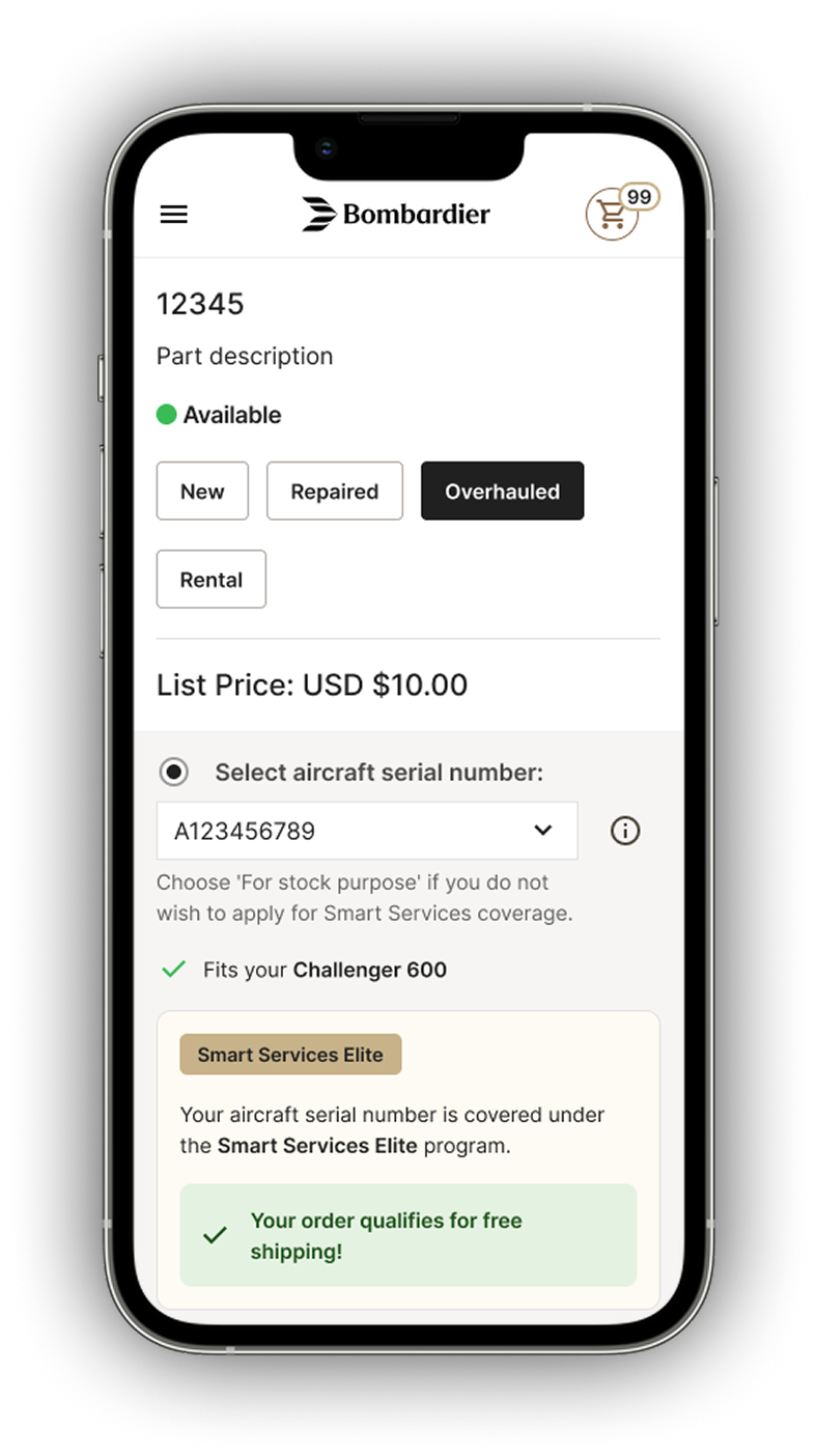
"Fits your [aircraft model name]" was a new little feature I proposed. Since the team already had the data, all we needed to do was adding a logic of scanning by the selected aircraft serial number and cross-check the list.
This kind of small change would reassure the users when they have to go through every single details of the part in a time-pressing environment.
Previously, the team mostly reacted to business requests or bugs flagged by QA to decide what to work on next. With the product already performing well, there was little pressure to proactively improve the experience.
By introducing a research-driven design process, it aligned stakeholders around real user needs and surfaced areas of the experience that had been overlooked.
Manami Izawa 2026© UX Portfolio